
Profile of Fine Press Printer Will Rueter

Will Rueter. Photo by Nigel Beale
First appeared in The Devil’s Artisan
Once or twice a year I head down to London, Ontario with a car full of books. I’m not looking for money. I’m looking for trade. And Marvin Post at Attic Books cuts me a pretty good deal. His used bookshop is one of the best in Canada certainly, if not North America. The turnover is significant so there’s always a new title to be found, which is why “trade” works so well for me. I can check his stock on-line every couple of months and always find something good to buy with my “money.”
Of course it’s a love of books that takes me on these trips.
Just as it took me to a little town called Dundas, near Hamilton some years ago. It’s sort of on the way to London if you’re coming from the east. Private press proprietor Will Rueter lives and works here. I stopped in to interview him for my Biblio File podcast. His words have stayed with me for a long time. I recently decided to commit them to writing. Here’s the result, complete with a bit of background.
Early Days
Will Rueter showed an early interest in books and letterforms - more than an interest - a total fascination. And yet as a young man, despite knowing this, he remained unsure of his path. In search of himself he decided to go to London, England in 1960. There he rented a room near the Victoria and Albert Museum and got to know its collection. He also visited the British Museum regularly, and he encountered The Book of Kells. “There it was. A page would be turned every week and I had a season’s pass. I'd never seen anything quite like it.”
During his time in England, Will took the opportunity to visit Holland and connect with his Dutch relatives. Here things started to make sense. Graphics, he learned, ran in the family. His Dutch great-grandfather had been a lithographer in Amsterdam. Printing was in his blood. In fact, to prove it, Will later bound an edition with paper that a great-uncle had designed circa 1900.
Upon his return to Toronto, Will signed up for graphic design classes at the Ontario College of Art (OCA). In December of 1962 he printed his first book on borrowed equipment. The work, says Will, was “absolutely atrocious - but it was a wonderful experience.” Although a novice, who knew little about printing at the time, one thing Will did know was that he loved doing it. In fact, he was seized with an intense, life-shaping desire to do more. He found a hand-press, a little Adana table model with a five by eight inch printing area, and a font of type (twelve point Bembo in Roman,Italic and small caps), and soon learned what was possible - spacing letters, mixing characters - when limited to just one typeface and very few variants. “I did a terrible job,I didn't know about type impression or that rollers had to be recast. I knew nothing at all about printing.” Gradually he added more type to his collection.
The typography course at OCA captivated Will. The only problem was that “everything was Swiss grid, Helvetica, very, very contemporary, very European. There wasn’t a lot of interest in classic typography. But there was a very good library at OCA and I read everything that I could possibly get my hands on.”
By the time he left OCA Will had already printed several books and broadsides, and had started to buy more type - when he could afford it, that is. He shared the cost of a small font of ornaments with Stan Bevington and the two of them traded information about typography. “Stan was an incredible influence on me as far as experimentation was concerned, [plus] everybody that I knew was hanging out at his Coach House Press. It was a very rich time for typography in the early '60s.”
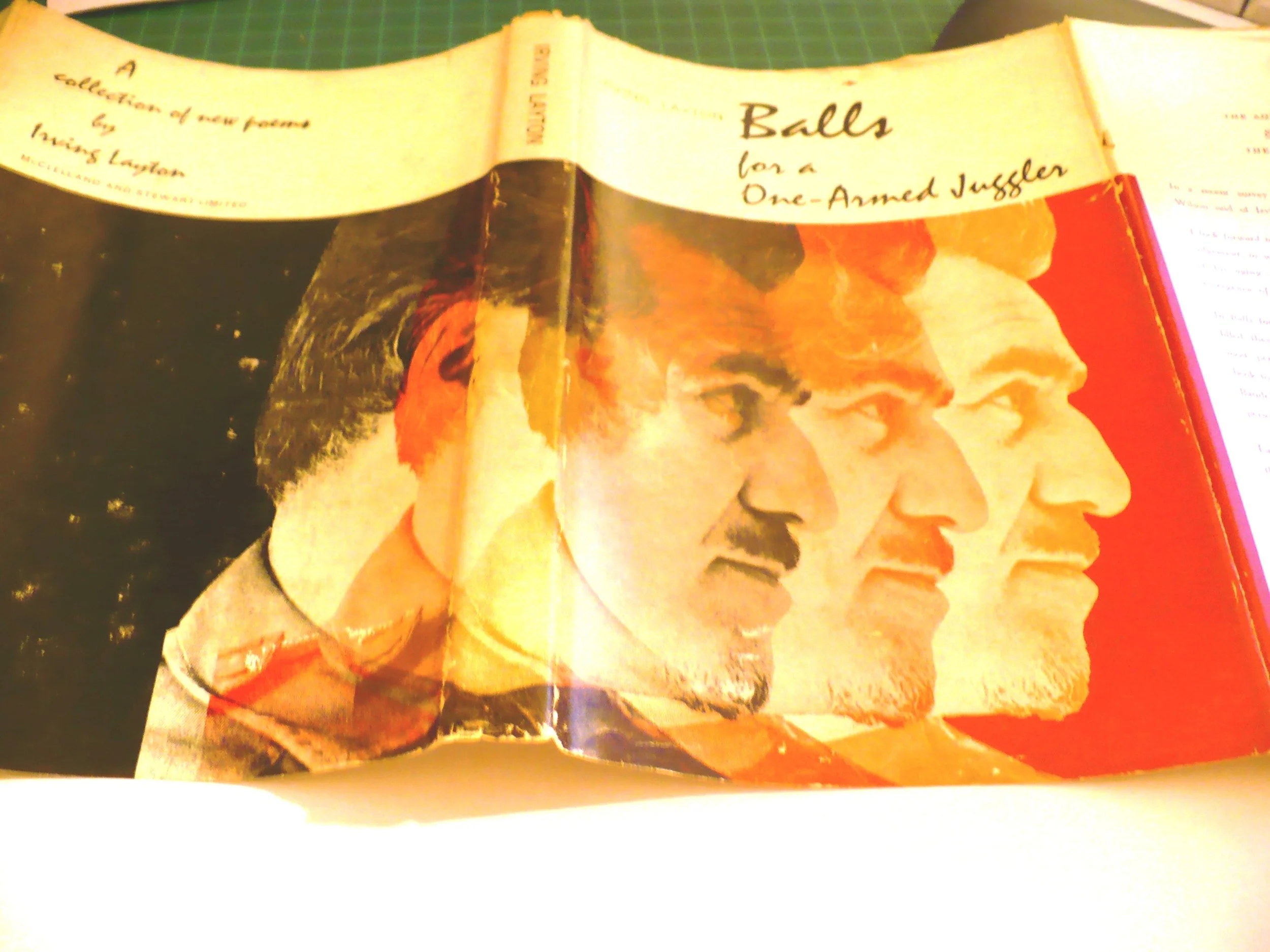
This observation is borne out by the great explosion of impressive book and graphic design work that was being produced in Toronto at the time. These years were, for example, book designer Frank Newfeld's most productive - A Red Carpet for the Sun, Balls for a One-Armed Juggler, Mad Shadows, The Double Hook, four ‘Design for Poetry’ books - all award-winning efforts that combined bold, striking colours, elegant typography and, in many cases, Saul Bass-inspired “extended preliminaries”.
Allan Fleming created his CN logo in 1959 and a stylish new re-design of MacLean’s magazine in November,1962. The Society of Typographic Designers of Canada (TDC) and the Art Directors Club of Toronto were established. From 1958-64 a series of formative Typography competitions and exhibitions were held. Foreign magazines featured work by Canadian designers. Things were happening. Marshall McLuhan musings about the media gained worldwide attention. Toronto was hot. The talent was cool. Or was it vice-versa? Either way, the Zeitgeist smoked.
In addition to an influx of impressive, well-trained designers arriving from England and Germany, Will also credits Toronto’s artistic vitality to what was happening in New York. “The advertising design was amazing. Lou Dorfsman, Herb Lubalin, Saul Bass movie credits for The Man with the Golden Arm. People were using letterforms like they'd never really used them before. Somehow in Canada, I think publishing companies were waking up to the fact that they needed professional designers. That's how Frank Newfeld was presenting himself.”
While there was a strong British sense of what was correct and proper, at the same time “really weird and wonderful things” were being produced. One of the teachers Will had at OCA was Frank Davies. He balanced off the Brits, as did Stuart Ash, who was producing dazzling advertising and searing logo designs at Gottschalk + Ash. “There was a real sense of the power that letterform had and how it could create mood and emotion, asking and answering questions.”
Will set up his Aliquando Press while he was a student at OCA, right in the middle of this bubbling design ferment. Thanks to lots of initial reading, the influence of some skilled instructors, and persistent trial and error, he was able to launch his modest private press. It has operated successfully now for close to sixty years.
His first book was A Bach Fugue. It’s a small volume containing a very short, short story written by a classmate in a creative writing course that Will took while he was in London. The author wrote sparingly and beautifully about the importance of art in our lives. Will still loves the book. “The design was very derivative and I did some terrible things. [Nonetheless] I showed it to Carl Dair, whom I knew slightly. He totally tore it to shreds, and rightly so.” Dair was a typography guru influential among designers in Canada and around the world. He wrote Design with Type, first published by the University of Toronto Press in 1952, and was the organizing force behind the Typography competitions/exhibitions mentioned above. He also designed his Cartier type, for Canada’s Centennial, right before he died of a heart attack in 1967 at age fifty-five. An idealist, he believed that type and design could and should be used as a force for good, and peace, in the world.
Will actually kept Carl’s letter. It’s a rarity. Criticism of this kind wasn’t very common. By now he was more confident working with words and type. This gave him a sense of power he felt he could harness and use to feed his passion. He would succeed in life by making books, by printing words. The path was clear.
Philosophy
Will compares his printing and design work to music. “There’s this sense of empowerment,” he says. “As a private printer you’re responsible for making the books yourself. It's like orchestrating from an open score where you choose the instruments. In my case I choose the visual elements.” It took him a long time to use good materials because for years he couldn't afford them. He was forced to use offcuts of paper and whatever he could scrounge up. “You use the best materials you can to make sure that the orchestra...is full of stars,'' he laughs. “Then you put the best darn binding you can on it. That way anybody picking it up, looking at it, having it in their hands, will sense, hopefully, that there's something exciting happening inside.”
Will goes for binding materials that have a roughness or “character” or visual appeal. Often he’s inspired simply by a piece of paper, thinking it’ll make a good book. Paper tends to hang around in his workshop. For example, he’s still got some that he bought more than 25 years ago from The Japanese Paper Place. He speaks of finding the perfect mix - text, typeface, beautiful illustrations - all coming together. Like it did with a little book he once made using a typeface called Fellowship designed and cast by Jim Rimmer from Vancouver. The text and the wood engravings are by Brian Kelly.The paper had been sitting around “forever.”
As for his operating philosophy, it’s simple: to make beautiful books using texts that appeal to him, to set them in beautiful type, and to bind them in ways that please him personally without having to worry about who might want to buy or collect them. If he’s got enough money in the bank to pay for paper and scrounge good ink when he needs it, he’s happy. He’s been buying materials long enough now to have accumulated a decent supply. These days it’s just a question of choosing an appealing text, selecting the right materials, and applying his design and production skills.
On the question of presentation, Will believes that if it helps the reader to better appreciate the word, whatever the word is, then it’s doing its job. “It'll be very interesting down the road to see if e-readers and reading devices can go that route. It's another way of reading. It's at a very early stage. I personally don't need to get involved with Kindles or Kobos. There’s nothing exciting or tactile about holding an e-reader, although the form does allow you to enlarge type very quickly, which is a great help if you've got bad eyesight. So much knowledge can now be mushed onto a smartphone, but it isn’t the same as a traditional book, no matter how many pseudo-leather cases they put on it. I think you read more slowly and attentively when you're reading a traditional book. You savour the experience a little more.”
“Someone has suggested that the iPad generation and the Twitter brains that go with it won’t be able to read with the same depth that traditional book readers do. I don't know. I can't imagine reading Bleak House on a Kindle. I think that's asking a lot. For informational reading, I can see it. If you're in a subway, an e-reader takes up less space. It just doesn't, for me, have the excitement of a traditional book. And because I'm having fun making my own books, I can choose, and enjoy things like marbled paper or exotic typefaces.”
Will suggests that artists will probably keep the codex form of the book alive, even if it diminishes commercially. “I don't know that it's ever going to go away, but then we never thought that eight-track tapes or buggy whips would go away either. Someone out there must be making buggy whips for buggies. But there aren't that many buggies around. We have become so technology-oriented and so image-oriented and we're much less focussed on print. But somehow the letterpress craft has survived this first-generation challenge.”
Thomas Coben-Sanderson

One of the books that Will is most proud of took him 18 months to complete. Majesty, Order and Beauty consists of a selection of excerpts from Cobden-Sanderson’s journals. T.J. Cobden-Sanderson was a friend of William Morris whose wife encouraged him to take up bookbinding. He became a master binder, and set up his own private press, the Doves Press, which subsequently produced some remarkable books. “He was mystical, a visionary in his own way. He really believed in the purity of letterform. He and William Morris were very good friends. I can't even begin to go into this. He certainly was my major hero when I started printing. We both began working with just one typeface, one size - only his printing was far, far better than mine.” [chuckles]
Early on, Coben-Sanderson was criticized for the austerity of his books, paring things back, not letting the design get in the way of the text. “That to me is a defining principle of good book design and typography. On the other hand, with many private presses, of course, you have your own personality. You want to put your mark on whatever book you do, while at the same time being respectful of the text. That’s so essential. It's a very fine line. You want to be invisible, you don't want to get in between the reader and the content, but you also want to make it as beautiful and as appealing as you can.”
“Austerity is important,’ says Will. “So are margins. You need room for your thumbs - “thumbage” - plus good quality materials, and you want to make the book readable, that's what it's about. Within those parameters you can have a lot of fun, but don't get in the way of the words; we’re stewards of the words.”
Will thinks that Kelmscott Press books are almost always over the top. “I see Kelmscott Press as glorified rugs - a lot of orientalia. Totally magnificent. Absolutely wonderful. Just a little too much. You can't knock William Morris. He was doing something that was totally his own. Perhaps design-wise for the wrong reasons at times, but he made unique and really beautiful books.”
These two printers, Cobden Sanderson and Morris, two designers, two visionaries, good friends, side by side changed the course of bookmaking and printing. “At the beginning of the last century everybody was doing the Kelmscott thing, many of them rather badly, Elbert Hubbard for example but then again he did seek his own direction, and more power to him, and the others.”
Cobden-Sanderson was Will’s hero because, as he says, his books are so refreshing. He designed a good book page with good margins. Of course, Will did go in his own direction but still, he keeps returning to the man, which is why he published excerpts from his journals.
“The text is very important to me. The journals were heavily edited after his death. All references to his dispute with his business partner Emery Walker were pretty much excised. Probably only half of the original journals survived. My friend Don Taylor chose the bookbinding entries, I did the printing excerpts. We basically pulled together all of the references to bookmaking in Coben-Sanderson’ journals. This was a wonderful excuse to make a book. I printed ten copies on handmade paper, specially bound. I'd love it if somebody took the book someday, scanned the pages and made a cheap trade edition from it because with one exception - a slightly repetitive entry that I now regret not putting in - it’s a pretty complete reflection of how his mind worked day-to-day. He was so passionate. Books were spiritual for him. The ideal book, the book beautiful, was something that he constantly strived for.”
2.
The Cobden-Sanderson book may be the one that Will’s most proud of, but he certainly doesn’t love all of his children equally. In fact there are some he wishes had never been born at all! I asked him about his progeny.
“ The first ten years of The Aliquando Press were interesting because I had a truly terrible printing press to work on. It was impossible to get enough impression, the type that I was using wasn't particularly good and I was mashing it. You learn from experience. There were a few people I could ask for advice. Stan Bevington was very knowledgeable about letterpress, even though he was switching to offset. But I still don't consider myself a great printer. On a good day, however, if I'm lucky and everything goes well, I can get a reasonable approximation of printing from the press.”
“In some ways I’m more interested in setting type. It’s like knitting - just row after row of individual characters. You put them on the press, you print them, then you distribute them back in the case. Then you start all over again. Majesty, Order and Beauty was about 18 months in the making. That was a lot of printing. I'm proud of it because I was able to reprint what I considered a very important text and bring it into the world in a slightly different form. That may be one to collect since it’s a new version of his work. It's always exciting when you find a completely new copy or a text that you think you can do justice to, and you're able to produce as many as 50 or 60 copies, hoping that two or three people will buy some of [them]. I have boxes and boxes of books in my studio that haven't sold. Some of those are the bad children [laughs] that I wish had never been born, but —"
“Orphans?”
“Yes. Orphans. I don’t like to acknowledge their existence. The book that you're working on at the moment, once you get started, often doesn’t excite you as much as the next book down the road. You're always thinking ahead. Again, I don't know what collectors look for. I think hopefully they're interested in beautiful books with interesting texts, well-produced, well typeset, physically intriguing.”
“There are many forms of books. The codex form that we've lived with since the fourth century is still, to my mind, the most perfect and the most practical. There are so many forms that have evolved along with the codex form: accordion-fold books, for example. I try to use different structures when I’m making a book. If the form seems appropriate to the text, it doesn't have to be a codex. I do a lot of broadsides for my own fun, just to try different type combinations. For example, I’ll do a short poem by Emily Dickinson or someone like that, just to see how it might look in 54 point Palatino, with a nice wood engraving. Maybe that idea will gel and come out ten years down the road as something more substantial.”
“How do you go about deciding what to print?” I ask.
“Initially I chose literary works that I thought were important [back] when I was at OCA and had a relatively small amount of type. It was interesting to do poetry because you can set a couple of pages and still have some characters left in the case. As I acquired more type it became easier to work.”
“I've done a fair number of books on music. I love printing bilingually, showing parallel languages. It’s nice to play one text off against the other. The line lengths are often different. The words are different. Part of the challenge, too, is that when you're setting bilingually, it's hard sometimes to have enough accents to do the work justice. But I can't imagine reading one language without being aware of the other. That gets us into the whole messy business of translation, because you never can translate accurately, although you can give a sense of the original.”
Prompted to put on the salesman’s hat to sell me some of his books, Will responds, “You’re looking at the wrong person. I don't think I can pitch my own work. This is a private press. It's not a commercial undertaking. I don't consider myself a publisher, but it’s true, I do have to make public something that is relatively private.”
As for authors who have interested Will, Spinoza comes first to his mind. “I've never printed long texts by Spinoza, but I love his quote: "All that is excellent is as difficult as it is rare." That just about sums up private printing and the insanity that goes with it. The literary canon - Shakespeare, Wordsworth; basically the writers Cobden-Sanderson was printing and to some degree William Morris, are important, but I also think that one also has a great responsibility to print contemporary works.”
“Contemporary poetry is ideal, there's some really good writing out there. You can print broadsides if you don't want to do whole books. Poetry doesn't sell. But poetry is always collectible, and it's relatively easy to do with a small amount of type. Jan Schreiber, for example, who has translated Walther von der Vogelweide, has occasionally sent me a manuscript. He's a very, very good poet. This book is one I'm very proud of too. Orvieto, a poem by Jan. It's an accordion-fold book that will open up into anything you want it to be. You can stretch it out or sit inside it. I tried to hold back on the typography to emphasize the text. This is an instance where I gave full reign to the wood engravings, but I hope they don't take away from the poem. As I say, there are many ways of doing a book and it doesn't always have to be the codex form.”
“I did a book to mark the 50th anniversary of the Press. Much the same format as Cobden-Sanderson, with quotes printed in many colours. Quotes about the private press, and four essays. I wrote an afterword trying to catch bits of information that weren’t covered, and also to explain what was important to me about the authors and the texts, because I'm very much aware of where I come from, the shoulders that I'm standing on, and the movement itself which is just amazing. It's astonishing what some private presses have achieved.”
“It's a very exciting time, I think, if you can maintain your own press with a certain seriousness. I also think you have to be really light-hearted sometimes and say, "Screw it - you’re being a silly bugger. Lighten up!” [laughs]
“Speaking of serious, you mentioned the word obsessive, and the obsession to get it right.”
“Yes. I think if you're going to buy equipment, invest in paper, scrounge type, you have a terrible responsibility - always to yourself - to do the very best that you can and to give the very best visual expression of the text to the reader, because the reader is who it's all about. You are always the servant of the word”.
“It's hard for me to look at my own work. Obviously, the Cobden-Sanderson book has a very special meaning for me because I worked bloody damn hard on it. I got some help from some very dear friends. The cover paper was a wallpaper that my great-uncle in Amsterdam had designed, probably around 1900. There was just enough to cover the boards. I was pleased to be uniting something physical from my family with a text of the period."
Five Fables by Pilpay, is another Will favourite. It’s sold out. The Anguish of The Heron by Gaétan Soucy is another. It’s translated by the excellent Sheila Fischman, who once worked at the U of T Press. Will actually got to print the English version before the French came out. “It's a very interesting novella. It was a real challenge. I did my own wood engravings for it. Had a lot of fun with it. I also decorated the cover paper and I'm very proud of that. The author was pleased, I'm also quite proud of a book I did with Wesley Bates, entitled Emblemata Amatoria, which contained slightly erotic wood engravings.’
The Nuns and the Gardener, a slightly naughty story by Boccaccio, was a book that Wesley Bates and Will also worked on together.
“There’s a bit of a history of private presses and naughtiness, isn't there?”
“Oh, lots of private presses do erotic and homoerotic work, and politically subversive work. The Dutch are very good at this. That's a whole separate story.”
“You're able to get away with it because it's artistic.”
“Yes. I used a typeface that Jim Rimmer designed, based on a 15th century design, and Wesley did these interesting engravings. We were going to do three Boccaccio stories, print some extra copies, and then bind all three stories from the extra copies into one book, but it's one of those unfortunate projects that just didn't come off. I'm very sorry in retrospect, as I was at the time. We all lead our separate lives and we have our own rhythms, but I'm very very proud of this book and I'm very pleased with the engravings that Wes did because they really are quite beautiful.”
“Last, Books books books, an experimental book I did many years ago, using every typeface I could find.It has a “waving flag” structure. You can literally fan yourself with it. Lots of quotes about books using the full arsenal of type. Here’s Julian Barnes: "If all your responses to a book have already been duplicated and expanded upon by a professional critic, then what point is there to your reading? Only that it's yours."
One of the defining features of The Aliquando Press - quite clearly demonstrated by Will’s selection - is variety. So many different shapes and sizes and formats to choose from.
University of Toronto Press
After the Ontario College of Art, Will worked as a graphic designer for a couple of years and married. Then in 1968 he received a short-term Canada Council grant and went to Europe for three months. There he visited the Monotype Corporation plant and asked lots of questions of lots of people, including famed bookman John Dreyfus. He also went to the Amsterdam Type Foundry with its amazing library, and just looked at books and read. While he was in Holland he stayed with one of his Dutch relatives.
After three months of absorbing everything he could in Europe, and a brief stop in England, he returned to Canada to look for a job. Allan Fleming interviewed him, and a few weeks later, “miraculously,” hired him to work at the University of Toronto Press. The coming decade, it turns out, was golden.
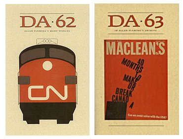
According to Will, what made it good, and golden, was a director, who despite knowing publishing could barely break even, wanted to make the Press’s books stand out internationally. Marsh Jeanneret had hired Fleming, who’d wanted to work as a book designer for some time and was willing to take a cut in pay to do so [ you can read about Fleming in two issues of the Devil's Artisan dedicated to him (62 and 63) ].
“There was a real sense that we were going to go places,” says Will. “going to make the world notice that an academic publisher can be just as good as any other. Macmillan and McClelland & Stewart were also really moving into the big time. There was just generally a good feeling. A strong belief that good design was important, essential.”
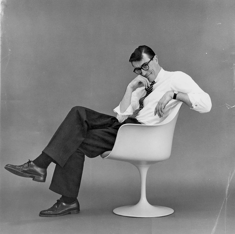
“Allan, of course, had the right idea because he was Allan Fleming.” He hired the best people and made sure that the best book materials were available. “He made beautiful, beautiful books. He wanted University of Toronto Press books to really stand out. Fleming was a very well-trained classic designer who could stretch the limits in every way possible. He had an incredible sensitivity toward books.”
Fleming and in turn Rueter were both hired by the right publisher at the right time. The press already had a strong editorial department so there were plenty of exciting manuscripts coming in. Things really came together between the mid-'60s to the mid-'70s. The Press also employed Antje Lingner and Laurie Lewis, who both made important contributions. “I like to think of myself as a good horse in this stable. Ange Lingner, who came from Germany was a very imaginative designer. Ellen Hutchinson did some good work, a lot of really subtle things. I think for us the excitement was that we were designing books that required a lot of detail: tables and charts and footnotes, and all sorts of problems needed to be solved. Allan was very good at helping to solve problems. Externally there may not have been a lot of flash on the covers, but many of the books were very solidly designed. There was a lot of intelligent, subtle design inside that made everything work.”
“The first book that I worked on was Milton's A Maske. I designed a horizontal format with the main text on the right-hand page and two varying texts on the left. The setting was so complicated that it had to be done on a typewriter because underlining and diacritical marks were required. It was really a challenge. One of the books that I did, too, was Prairie School Architecture, which I'm very, very fond of because it was a study of Frank Lloyd Wright's buildings. Again, there were some complicated problems to solve. I didn't know very much about what I was doing, but we were given the time, and the option to do it well.”
“Then, unfortunately, by about the mid-1970s, right across Canada, the axe began to fall, and we had to cut costs. Allan was told to design a standard format for all books. This made sense because every book could no longer be designed individually. It was one way of cutting costs. Unfortunately, that became the rule. So when a book really needed a special design treatment there was just no money for it, or money couldn't be allocated. Design just wasn't considered important.
“There were several books that I think would have really benefited from a more sensitive design approach. They were up against it in simply trying to survive. It's just very unfortunate that once [management] got into this mindset, it couldn't be changed and the dollar sign ruled - or the lack of dollar signs.”
1955 to 1975 has been called the golden age of Canadian book design. It wasn’t just the work, says Will, it had a lot to do with the respect that management had for its employees. “I think one of the sad things in publishing and everywhere else is that if you lose the people who have the experience, you lose the tradition. The continuity goes. And the loyalty. If you have a core group, and they're well trained, and they're dedicated and treated with respect, you can go a long way.”
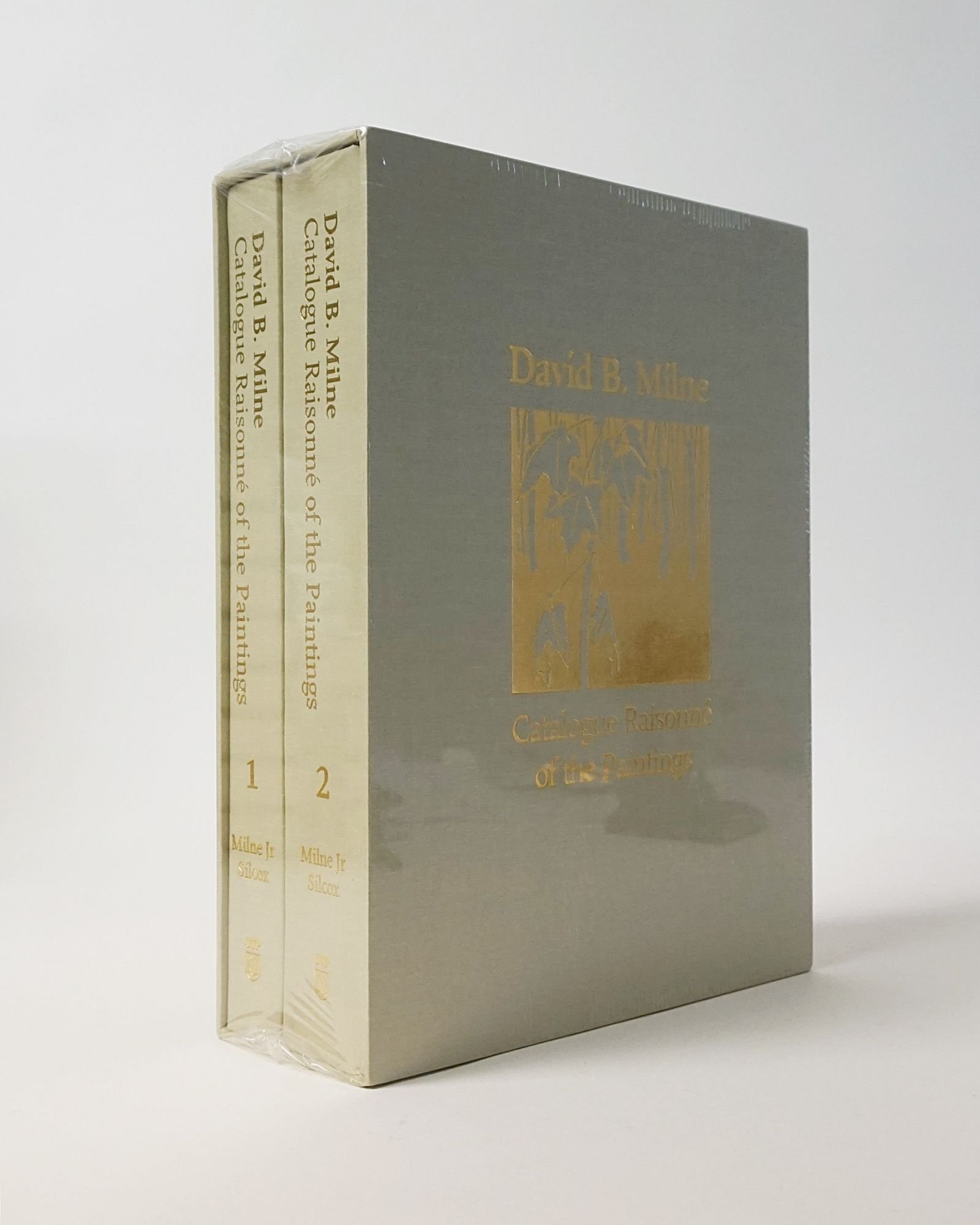
Time at the U of T Press constitutes a big part of Will’s career. During his 30-year tenure, 1969-1998, he designed several thousand books in one form or another. Even after format standardization there remained the need to incorporate unique details into many of the books. In fact, the project he most loves, David Milne’s Catalogue Raisonne, required exactly this. It came near the end of his professional career. “David Silcox just assumed that it was going to be the perfect book and he was going to do everything he could to make it so. Ultimately, it was an absolute joy to work on. The Milne book was a great one to go out with. Milne remains, in my view, the most influential and important artist of the period. Just an incredible visionary in his way. I enjoyed that project so much. I get quite emotional though, [laughs] because it had a budget, or a budget was found, because Silcox insisted that it was going to be done properly.”
****
A year ago I returned to Dundas to interview Will again, this time about Thomas Cobden-Sanderson. I knew how much C-S meant to Will and figured that by getting him to talk about his hero he’d not only provide a good ‘best practitioner from the past’ profile for the podcast, he’d also reveal something more of himself.
I wasn’t disappointed.
To summarize, I learned that Will always strives to make a better book; he’s difficult to satisfy. He has a profound, hard-earned knowledge of the book-making practice. He’s inquisitive, curious, dedicated and persistent. And he respects the intentions of those who create the words he works with.
All of this is reflected in his 60-year oeuvre.
And there’s one other thing that’s so clear it’s astounding.
When Will talks about words that he loves - ‘The Seafarer’, for example, an old Anglo-Saxon poem that he translated and made into a book - there’s a deep, deep emotion that expresses itself in his voice. This is the ingredient that enables him to present beautiful words in beautiful ways. Listening to him speak with such obvious reverence for the text made it easy for me to understand what he meant when he said how essential emotion is to printing. How the ‘Book Beautiful’ is only possible when the two are present. “Where,” as Cobden-Sanderson puts it,
“...the idea to be communicated by the book comes first, as the thing of supreme importance. Then comes in attendance upon it, striving for the love of the idea to be itself beautiful, the written or printed page, the decorated or decorative letters and pictures, set in their lovely frames amid the text, and finally the binding holding the whole in its strong grip and for very love again itself becoming beautiful because in the company of the divine.”
****
Not long after interviewing Will the first time round I returned to London with another load of books. Once the boxes had been lugged into the store and the calculations made I started scoping out the stock on the floor. One book dominated my thoughts.
It didn’t take long. There sitting in a glass presentation case was David Milne’s Catalogue Raisonne, both volumes, in slipcase. My memory may be playing tricks on me here, but I’m pretty sure there was this little stream of light shining down on it. Like from heaven.
There’s a wonderful mystery about books.
Just like Coben-Sanderson said.